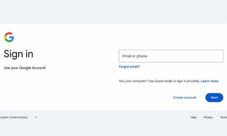
After teasing it for the past couple of weeks, Google is rolling out a new sign-in page with a slightly cleaner design. The changes are small and don’t affect functionality, but it’s something that users encounter often, and Google has been using the previous version since it changed its logo, as far as I can see.
The refresh puts the sign-in (and sign-up) page more in line with the company’s Material Design ethic introduced back in 2014. To that end, it’s now aligned left (instead of centered) and features an orientation that automatically adjusts to your screen’s size — so it’s wider on PC screens and narrower on smartphones. It shows up on all types of devices, but may not appear on older browsers, the company said.
The biggest previous change Google made to its sign-in page was putting password entry onto a second page back in 2015. That update was made “in preparation for future authentication solutions that complement passwords,” and to reduce confusion among people who have multiple Google accounts, it said at the time.
Google emphasized that the change will be permanent, much like the switch to Gmail’s integrated view. The rollout will be fairly gradual, starting on February 21 and set for completion by March 4, 2024.
Source link